I’ve been on Mastodon for about two and a half months now, which I think is long enough to have formed some opinions about where it could use some improvement. (“Where Mastodon Could Use Some Improvement” is a less-catchy title than “What Mastodon Needs”, though.)
Things are starting to move a bit faster in Mastodonia, since Twitter has started blocking its third-party client APIs, which killed off my preferred Twitter client, Tweetbot, a couple of weeks ago. Consequently, I have barely logged into Twitter since then, since as I’ve written before, the official Twitter client just isn’t good enough. And not supporting Elon Musk: Space Nazi is a side benefit.
So like many others I have just moved my microblogging over to Mastodon.
Some people who fondly remember the early days of Twitter (n.b.: I am not such a person) are excited about this period on Mastodon because we’re starting to see more client apps appearing in app stores. For example:

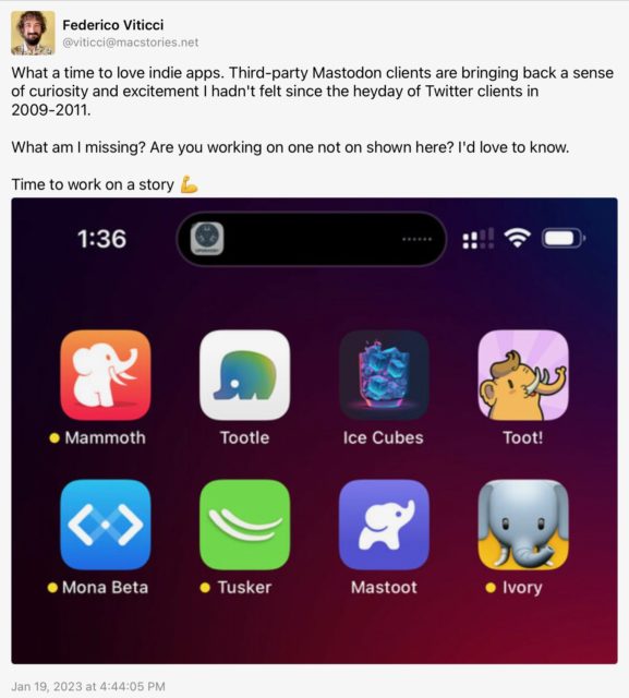
While this is exciting, for people like me it’s also a little concerning: I’m not going to use or even try every client that comes out (probably ????). I’m going to settle on one, and probably fairly soon, and it’s going to be the client that provides the best user experience for me, and which has the features that aren’t part of Mastodon itself which I really want.
When I wrote my initial post about Mastodon two months ago, I was using Metatext as my iOS client. That app’s developer has stopped developing it “for a while”, so I switched over to Toot!, which I like a lot and which is under very active development. Meanwhile the situation on macOS is still quite dire. I’m still using Mastonaut, though I really tried to use Whalebird for a while, but it has a lot of polish issues which pushed me back to Mastonaut even though its dev has stopped supporting it (because he now works for Apple).
One of the problems here is that interoperability between these apps is only what the Mastodon server software supports, so switching back and forth between them is awkward at best. So I think it’s really important for the Mastodon server software to start ramping up significantly to add features which will be widely-used. I don’t have any real visibility into how often it gets updated, or how many people are actively working on it, but hopefully we’ll see a lot of movement this year.
With that as a preamble, here are things that I’m really missing in my Mastodon experience:
1. Remembering my reading position: John Siracusa summed this up well:
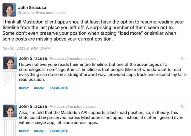
Toot! remembers your position in any given instance of its client, but it isn’t synced to your other devices using Toot!, much less to other clients. Toot! sort of helps with this by not showing you every single toot in your timeline as you scroll up from your last position, but letting you click “load more” as you scroll up. It’s the bare minimum, but it’s not enough. Mastodon should remember this on the server side and let all clients access it. And it should remember it for other timelines (Local, Federated, Trending, and Lists) as well.
(I have no idea how Twitter or its third-party clients handled this. I suspect Tweetbot remembered this position and synced it to other instances of its client via iCloud, but I don’t know. And it doesn’t really matter how it works, just that it should work.)
Toot! did add an unread count to the timeline recently, which is really nice, but still not quite enough.
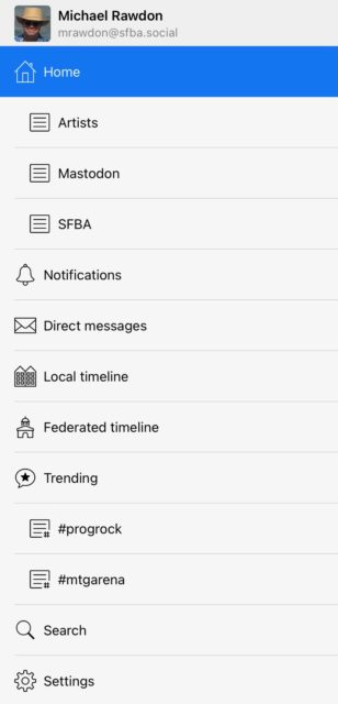
2. Lists need a more prominent UI: Toot! has a pretty nice UI on the iPad for accessing lists:
The lists are shown right in the sidebar, as are saved hashtag searches. Very convenient (or it would be if I actively used them – more on this in a moment). This might not scale if you have a lot of these things, but some sort of disclosure UI would probably do the job, and there might be even better ways.
By contrast, here’s the UI to access lists in the Ice Cubes app on iPad:
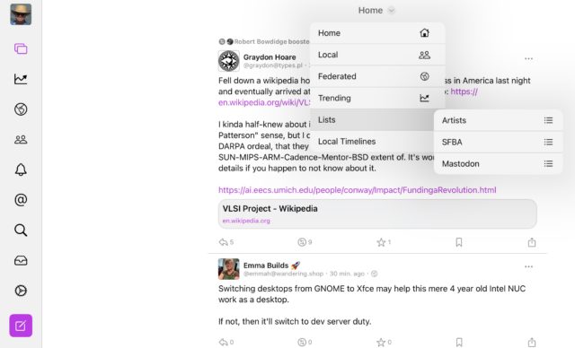
You have to click on the Home dropdown, click on Lists, and then select a list. This is so hidden that I’ll probably never use it. It needs to get rid of at least one click.
The UI in the Mastodon web interface is so bad I’m not even going to screenshot it. It’s not worse click-wise than Ice Cubes, but it’s much more obscure.
If Lists are going to be useful then they need to have a prominent UI. Each client should keep this in mind. I also like the model of pinned lists in both Tweetbot and the official Twitter client.
3. More powerful muting of users: This is a key feature to make Lists useful. Right now when you add someone to a list they also stay in your main timeline. If you mute them, then they get muted everywhere. This makes Lists basically useless to me: The whole point of lists for me is to disperse the people I follow.
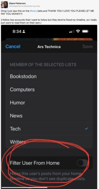
In Tweetbot I did this with selective muting: I could mute a user from my main timeline, from lists, or from searches. Usually I’d mute them from my main timeline and show them everywhere else. It seems that Tapbots’ upcoming Mastodon client Ivory is going to have a “Filter User From Home” option:
This will probably meet my needs, but it’s something else that the server software should handle. (I did a search a while back and found a commit to the Mastodon source from a couple of years ago which seemed to be exactly this, but it doesn’t work so it might have been backed out.)
And this is the sort of thing which is going to lead to client lock-in where people like me who rely on this functionality will not only not try clients which don’t support it, but will be reluctant to switch clients at all because we won’t want to spend time reconstructing our mute lists.
(As a small aside, Tweetbot had an annoying behavior when you turned off retweets for a user in that it would only apply to the main timeline and not to lists. This made for a pretty crappy experience for how I used lists and led me to unfollow some users who retweeted a lot. More control here would be nice, but “turn off boosts everywhere” should be the default behavior if we can only have one.)
4. Bookmarks should have a more prominent UI: Mastodon has separate “like” (called “favourite”) and “bookmark” functionality, which is great since it was never entirely clear on Twitter when you Liked something if you were expressing approval or just saving it for later. (I used Likes as bookmarks and rarely liked something I didn’t want to save to find later.)
Unfortunately Bookmarks in Mastodon have a pretty hidden UI. Most clients seem to only let you access them from your user page, and don’t have a button to bookmark a toot – it’s hidden under a “more functions” popup. I think Bookmarks are likely to be a desirable feature that lots of people will want to use and they should get a more prominent UI.

(All of this might indicate that Mastodon clients will want to provide some sort of configurable interface so users can set things up so they can easily get to the features they want and put the ones they don’t behind a menu. For example I almost never look at the Federated timeline. We’ll see.)
5. Saved searches: As seen in the screenshot above, Toot! has a nice feature to save searches which as far as I can tell is exclusive to Toot!, and isn’t synced at all. This isn’t essential to me, but I used it sometimes on Twitter, and Mastodon’s hashtag-based searching is really handy in directing you to toots that are highly likely to be of interest, so I would love to see this get server support.
6. Filter by toot type or content: This was a nifty little feature of Tweetbot where you could filter whatever you’re looking at to see only tweets with media, or without replies, or various other options. I used it some and while it wasn’t essential, it was really useful when I did.
It’s definitely true that Mastodon – despite being almost 7 years old – both has a lot of room to grow, and is well-positioned to see many exciting and useful innovations in the near future. But I hope the server software authors and the app authors will keep these features in mind, as I think for many mid-range users like myself (and maybe some power users as well) there’s going to be a limit to how fully we’re willing or able to engage with Mastodon without features which significantly improve our ability to control what we read and when, and how much effort we need to put in just to get to the new material.
I expect we’ll see a lot of innovation and competition in the client space this year, but if we get to the end of 2023 and we haven’t seen at least one or two of the early items on this list knocked out on the server side, then I’m going to be pretty disappointed. And I bet there are other features I don’t even think about which are important to others to have on the system.
(P.S.: I despair that we’ll get a good Mac client any time soon. But I’d settle for an iPad client I can run on Apple Silicon Macs.)

