What Bluesky Needs

Back in January I wrote a post titled “What Mastodon Needs”, about what I felt were the most serious shortcomings of that social media platform after I’d been on it for a couple of months. (Some of those issues have been resolved by my settling on Ivory as my Mastodon client, but others remain stubbornly unresolved, joined by new ones such as a lack of quote-reposts.)

I thought it’s time to write one on the other would-by Twitter replacement platform I spend some time on, Bluesky.

Full transparency: I find Mastodon a lot more useful and enjoyable than Bluesky. But many people are the other way around. Indeed, when I see someone compare the two, it’s almost always in Bluesky’s favor. Last month I made the following observation:
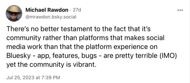
Post by me on Bluesky: "There's no better testament to the fact that it's community rather than platforms that makes social media work than that the platform experience on
Bluesky - app, features, bugs - are pretty terrible (IMO) yet the community is vibrant."

There are also people who have found Mastodon to be a mixed-to-negative experience. I could pull a number of examples, but here’s a particularly prominent one from today:
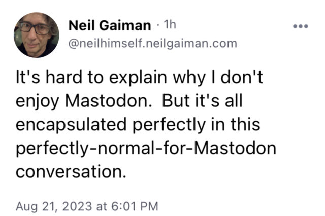
Bluesky post by Neil Gaiman: "It's hard to explain why I don't enjoy Mastodon. But it's all encapsulated perfectly in this perfectly-normal-for-Mastodon conversation."

(see next image)
Neil Gaiman post about how he feels when his books are banned is replied to by an anonymous user with: "A pro library post with a quote about how I feel when my books are banned is replied to with
"Mmhhh... This unicorn mindset doesn't really fit with Mein Kampf, though."

All of this is fair enough. And Bluesky does have a few significant detractors, often people with problems with its ownership. Which is also fair enough. After all, I’m not on Threads because I don’t really want to get deeper into the Facebook ecosystem.

Anyway, my main goal here is to hit major points of usability where I feel Bluesky is lacking. And I should be clear that I realize that Bluesky is a platform which is still in beta (indeed, it feels like it’s not quite ready for beta and I suspect it opened up before it had planned to), is still invitation-only (only users with invite codes can invite new users), and reportedly has very small development team. So I expect progress will be slow, and it’s starting from a point of being much less mature than Mastodon.

So here we go:

1. Lists: I’ve been an avoid user of lists on both Twitter and Mastodon. I have a dozen or more lists which I use to divide up accounts I follow by category, saving my main timeline for accounts I either want to check in with whenever I check in on the platform, or which don’t fall into a category. But, for example, I put most Magic: The Gathering accounts, or audio drama accounts, into their own list. And I remove them from my main timeline. (This last point is something neither Twitter nor Mastodon supports natively, I think, but some apps like Tweetbot did and Ivory does.)

Not having lists is likely to impose a strong cap on how many accounts I follow. This isn’t an issue yet (I’m following only 39 accounts – Bluesky is still small, folks), but it will be if the site gets popular.

2. Remembering my reading position: This was a bullet point for Mastodon, and it’s a problem on Bluesky, too.

3. An iPad app which doesn’t suck: Presently the iPhone app runs on the iPad in compatibility mode, which is frankly pretty lousy – especially because it’s pretty buggy and its UX is not very polished. Instagram also has the problem of no native iPad app, but it’s not as much of an issue there because Instagram is image-centric.

4. Disabling reposts per-user: Some people repost a lot. Which is fine – people can do with their accounts what they want. But I find being able to disable reposts for a few users significantly improves my experience on social media, when I enjoy the personally-written posts by those users but mostly find their reposts to be a fire hose of things which are way more important to them than to me. Right now my only option is to mute them entirely (which I have done a couple of times).

Related to this is being able to mute a user (or a keyword!) for a day, a week, or a month, since sometimes people get focused on something which is time-bound which doesn’t interest me, but once that time is passed I want to resume following them.

These are little things that Twitter and/or its third party clients provided which turned out to be indispensable to enjoying it in the long run.

5. Bookmarks and a way to see your Likes: Mastodon has both Likes and Bookmarks. Bluesky has Likes but no Bookmarks, and as far as I can tell there’s no way to view a list of the posts you’ve Liked.

6. Hashtag support: This would be a more useful way to find like-minded people and posts than Bluesky’s feed system, which my experience with so far has found it to be pretty clunky.

The other big problem is one I think all social media sites going forward will have: Fragmentation of communities. The tech community is mostly on Mastodon, the science fiction and comic book communities are on Bluesky, and the Magic: The Gathering and audio drama communities are still very sticky on Twitter (or, as I like to call it after its X rebrand, Shitter). There probably isn’t a “solution” to this, it just means that people like me who follow multiple communities will need to be on multiple platforms.

Anyway, Bluesky does have a fair bit of fun stuff happening (and not all of it revolving around Neil Gaiman, John Scalzi and Popehat), it’s just that the platform itself makes it difficult for me to interact with. I hope it gets better, but I’m not going to hold my breath for that to happen.

What Mastodon Needs

I’ve been on Mastodon for about two and a half months now, which I think is long enough to have formed some opinions about where it could use some improvement. (“Where Mastodon Could Use Some Improvement” is a less-catchy title than “What Mastodon Needs”, though.)

Things are starting to move a bit faster in Mastodonia, since Twitter has started blocking its third-party client APIs, which killed off my preferred Twitter client, Tweetbot, a couple of weeks ago. Consequently, I have barely logged into Twitter since then, since as I’ve written before, the official Twitter client just isn’t good enough. And not supporting Elon Musk: Space Nazi is a side benefit.

So like many others I have just moved my microblogging over to Mastodon.

Some people who fondly remember the early days of Twitter (n.b.: I am not such a person) are excited about this period on Mastodon because we’re starting to see more client apps appearing in app stores. For example:

Aaron Ross Powell (@arossp@mastodon.social) toots: I love that I have half a dozen #Mastodon client apps installed on my phone, they're all under active development, and they all have as many (or more) features as the official app. It feels like the early days of Twitter apps, but without even the possibility of the rug getting pulled out from under it.
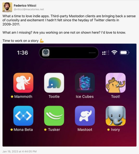
Federico Viticci (@viticci@macstories.net) toots: What a time to love indie apps. Third-party Mastodon clients are bringing back a sense of curiosity and excitement I hadn't felt since the heyday of Twitter clients in 2009-2011.

What am I missing? Are you working on one not on shown here? I'd love to know.

Time to work on a story

While this is exciting, for people like me it’s also a little concerning: I’m not going to use or even try every client that comes out (probably ????). I’m going to settle on one, and probably fairly soon, and it’s going to be the client that provides the best user experience for me, and which has the features that aren’t part of Mastodon itself which I really want.

When I wrote my initial post about Mastodon two months ago, I was using Metatext as my iOS client. That app’s developer has stopped developing it “for a while”, so I switched over to Toot!, which I like a lot and which is under very active development. Meanwhile the situation on macOS is still quite dire. I’m still using Mastonaut, though I really tried to use Whalebird for a while, but it has a lot of polish issues which pushed me back to Mastonaut even though its dev has stopped supporting it (because he now works for Apple).

One of the problems here is that interoperability between these apps is only what the Mastodon server software supports, so switching back and forth between them is awkward at best. So I think it’s really important for the Mastodon server software to start ramping up significantly to add features which will be widely-used. I don’t have any real visibility into how often it gets updated, or how many people are actively working on it, but hopefully we’ll see a lot of movement this year.

With that as a preamble, here are things that I’m really missing in my Mastodon experience:

1. Remembering my reading position: John Siracusa summed this up well:

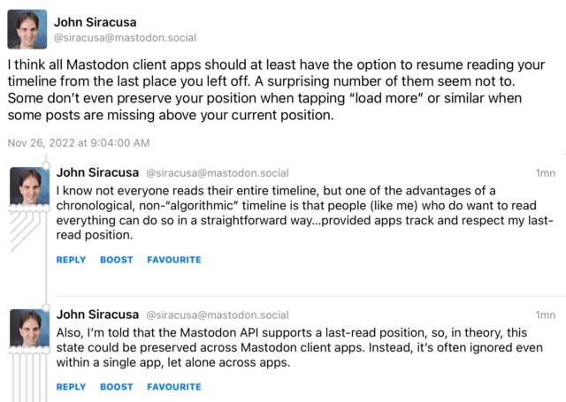
John Siracusa (@siracusa@mastodon.social) toots: I think all Mastodon client apps should at least have the option to resume reading your timeline from the last place you left off. A surprising number of them seem not to.
Some don't even preserve your position when tapping "load more" or similar when some posts are missing above your current position.

I know not everyone reads their entire timeline, but one of the advantages of a chronological, non-"algorithmic" timeline is that people (like me) who do want to read everything can do so in a straightforward way...provided apps track and respect my last-read position.

Also, I'm told that the Mastodon API supports a last-read position, so, in theory, this state could be preserved across Mastodon client apps. Instead, it's often ignored even within a single app, let alone across apps.

Toot! remembers your position in any given instance of its client, but it isn’t synced to your other devices using Toot!, much less to other clients. Toot! sort of helps with this by not showing you every single toot in your timeline as you scroll up from your last position, but letting you click “load more” as you scroll up. It’s the bare minimum, but it’s not enough. Mastodon should remember this on the server side and let all clients access it. And it should remember it for other timelines (Local, Federated, Trending, and Lists) as well.

(I have no idea how Twitter or its third-party clients handled this. I suspect Tweetbot remembered this position and synced it to other instances of its client via iCloud, but I don’t know. And it doesn’t really matter how it works, just that it should work.)

Toot! did add an unread count to the timeline recently, which is really nice, but still not quite enough.

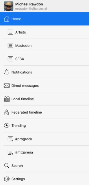
2. Lists need a more prominent UI: Toot! has a pretty nice UI on the iPad for accessing lists:

Toot! app list UI for Mastodon

The lists are shown right in the sidebar, as are saved hashtag searches. Very convenient (or it would be if I actively used them – more on this in a moment). This might not scale if you have a lot of these things, but some sort of disclosure UI would probably do the job, and there might be even better ways.

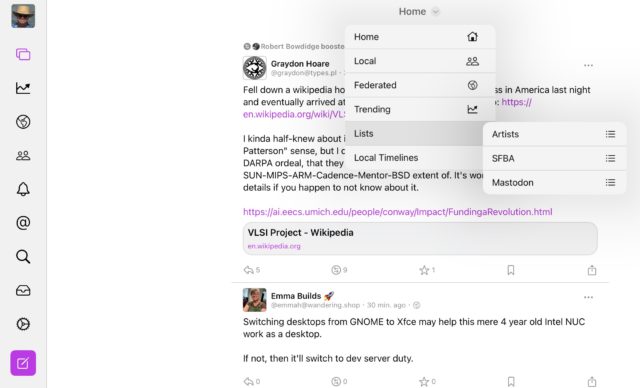
By contrast, here’s the UI to access lists in the Ice Cubes app on iPad:

Ice Cubes app list UI for Mastodon

You have to click on the Home dropdown, click on Lists, and then select a list. This is so hidden that I’ll probably never use it. It needs to get rid of at least one click.

The UI in the Mastodon web interface is so bad I’m not even going to screenshot it. It’s not worse click-wise than Ice Cubes, but it’s much more obscure.

If Lists are going to be useful then they need to have a prominent UI. Each client should keep this in mind. I also like the model of pinned lists in both Tweetbot and the official Twitter client.

3. More powerful muting of users: This is a key feature to make Lists useful. Right now when you add someone to a list they also stay in your main timeline. If you mute them, then they get muted everywhere. This makes Lists basically useless to me: The whole point of lists for me is to disperse the people I follow.

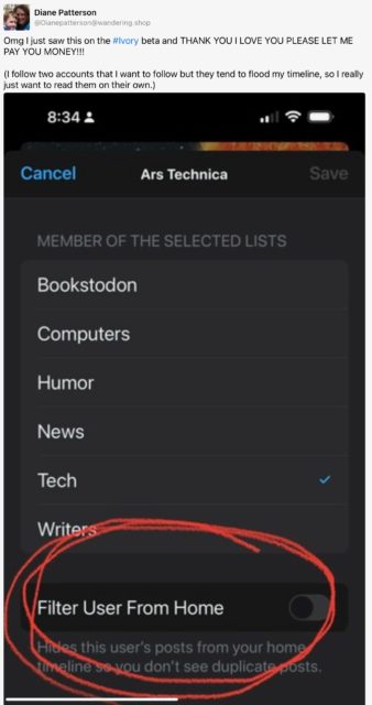
In Tweetbot I did this with selective muting: I could mute a user from my main timeline, from lists, or from searches. Usually I’d mute them from my main timeline and show them everywhere else. It seems that Tapbots’ upcoming Mastodon client Ivory is going to have a “Filter User From Home” option:

Screenshot of Ivory's Filter User From Home option.

This will probably meet my needs, but it’s something else that the server software should handle. (I did a search a while back and found a commit to the Mastodon source from a couple of years ago which seemed to be exactly this, but it doesn’t work so it might have been backed out.)

And this is the sort of thing which is going to lead to client lock-in where people like me who rely on this functionality will not only not try clients which don’t support it, but will be reluctant to switch clients at all because we won’t want to spend time reconstructing our mute lists.

(As a small aside, Tweetbot had an annoying behavior when you turned off retweets for a user in that it would only apply to the main timeline and not to lists. This made for a pretty crappy experience for how I used lists and led me to unfollow some users who retweeted a lot. More control here would be nice, but “turn off boosts everywhere” should be the default behavior if we can only have one.)

4. Bookmarks should have a more prominent UI: Mastodon has separate “like” (called “favourite”) and “bookmark” functionality, which is great since it was never entirely clear on Twitter when you Liked something if you were expressing approval or just saving it for later. (I used Likes as bookmarks and rarely liked something I didn’t want to save to find later.)

Unfortunately Bookmarks in Mastodon have a pretty hidden UI. Most clients seem to only let you access them from your user page, and don’t have a button to bookmark a toot – it’s hidden under a “more functions” popup. I think Bookmarks are likely to be a desirable feature that lots of people will want to use and they should get a more prominent UI.

dougal (@dougal@mastodon.social) toots: I wish #Mastodon clients would make #bookmarks a first-class toolbar feature, alongside commenting, favoriting, reblogging, and sharing. One use case that happens for me a lot is to see a reference to an article I want to read. But I'm busy right now and I don't want to decide whether to star the toot until I've read the article. I want to bookmark it so that I can find it again later, so having that feature immediately available
saves me trouble and time.

(All of this might indicate that Mastodon clients will want to provide some sort of configurable interface so users can set things up so they can easily get to the features they want and put the ones they don’t behind a menu. For example I almost never look at the Federated timeline. We’ll see.)

5. Saved searches: As seen in the screenshot above, Toot! has a nice feature to save searches which as far as I can tell is exclusive to Toot!, and isn’t synced at all. This isn’t essential to me, but I used it sometimes on Twitter, and Mastodon’s hashtag-based searching is really handy in directing you to toots that are highly likely to be of interest, so I would love to see this get server support.

6. Filter by toot type or content: This was a nifty little feature of Tweetbot where you could filter whatever you’re looking at to see only tweets with media, or without replies, or various other options. I used it some and while it wasn’t essential, it was really useful when I did.

It’s definitely true that Mastodon – despite being almost 7 years old – both has a lot of room to grow, and is well-positioned to see many exciting and useful innovations in the near future. But I hope the server software authors and the app authors will keep these features in mind, as I think for many mid-range users like myself (and maybe some power users as well) there’s going to be a limit to how fully we’re willing or able to engage with Mastodon without features which significantly improve our ability to control what we read and when, and how much effort we need to put in just to get to the new material.

I expect we’ll see a lot of innovation and competition in the client space this year, but if we get to the end of 2023 and we haven’t seen at least one or two of the early items on this list knocked out on the server side, then I’m going to be pretty disappointed. And I bet there are other features I don’t even think about which are important to others to have on the system.

(P.S.: I despair that we’ll get a good Mac client any time soon. But I’d settle for an iPad client I can run on Apple Silicon Macs.)

Mastodon

A popular destination for participants in the Twitter diaspora has been Mastodon, which broadly resembles Twitter (you have a timeline of people you follow, you respond to their posts, like them, and add them to your own timeline) but is different in some key ways. The most important way is that it’s a distributed network, where people join a specific instance (the term for a server), but can follow people on that or any other instanced.

I joined Mastodon briefly back in 2018 during some other scare over Twitter that I don’t even remember anymore, but the instance I joined is now defunct. With the Twitpocalypse apparently upon us I looked around for a new instance. I was reluctant to join one of the really big instances (like mastodon.social), though I’m now not sure why. Mastodon gives you a timeline of people you follow, but also one of everyone on your instance, so I decided to look for an instance with a community I might enjoy following, and ended up on sfba.social, and you can find me here.

Things are moving pretty fast and people are now recommending joining instances which are well-supported, able to handle the influx of new users, and have good moderation policies regarding the usual racist/sexist/homophobic/transphobic and other shitheads. While I don’t think my instance has been put to the moderation test yet (though it does have a list of limited and blocked instances), they’re doing pretty well on the other scores – it was under 3k users when I joined, doubled that in a day, and is now closing in on 30k, and while there have been a few bumps they’ve been ramping up capacity and asking for donations to pay for it.

As a Twitter substitute Mastodon works pretty well, depending on what you’re looking for, and keeping in mind that it hasn’t yet scaled to anywhere near the size of Twitter. For example, you can’t limit who can reply to your “toots” (as posts are called there), and it’s not even clear how that would work in a distributed system like this. I also don’t think the Legion of Shitheads has yet descended on the Fediverse (as the collection of federated servers is called), so there hasn’t been a real trial of the agglomeration’s moderation facilities.

The web interface is serviceable, and there are some good apps for iOS out there – I’m using Metatext. macOS apps are more of a work in progress: I’m using Mastonaut there, and it’s okay, but (for example) it doesn’t support bookmarks. (I’ve also been using Metatext on my Apple Silicon Macs, and it’s really close as to whether I like it better than Mastonaut there. So far Mastonaut is winning.) I also just started using Toot!, as it released its first update in a couple of years this week and it has good word-of-mouth. (It’s not available for Apple Silicon Macs, though.)

There’s a lot of opportunity for UI innovation in these apps, because for the most part they’re fairly small refactors of the web UI. Maybe Tapbots will fill that space. I wasn’t really around for the era of innovation in Twitter clients over a decade ago, so this is a new experience for me. All the clients I’ve tried so far are superficially similar but can be very different in the details. UI design is hugely influential in whether certain features are discoverable and usable, and if people are using a variety of different clients then that could really impact how the system evolves.

Functionally, I appreciate that Mastodon separates favourites (a.k.a. likes) from bookmarks, as I mainly used likes on Twitter as bookmarks and so was somewhat stingy with what I’d like. I’m starting to use each differently on Mastodon.

I haven’t yet tried the lists feature. I use lists a lot on Twitter, but in an idiosyncratic way: Most people I add to a list I mute from my main timeline, but a few I don’t, and I don’t know if I can do any of that on Mastodon. Lists looks like it’s not yet a first-class feature, as it’s somewhat obscure in the web UI, really obscure in Metatext, and doesn’t seem to be supported yet in Toot! (though it might be coming).

One thing I really miss from Twitter is an unread count for my main timeline. I realize the distributed nature of Mastodon probably makes this a little tricky, but it seems like it ought to be possibly to provide a reasonable estimate. I also miss syncing my read location across my devices, something Tweetbot does really well for Twitter. I read social media across something like 7 devices (3 iOS, 4 Macs), so it gets annoying to always be scrolling up to find the last few toots I’ve read.

It feels like Mastodon is still in its honeymoon period, and I see quite a few tweets indicating that people are aware of that. The culture is a combination of what the software supports, enforces or guides users to, and the norms that long-time users have imposed. If the system continues to grow, I expect those norms will be gradually (and at times abruptly) transformed as newer users vote with their behavior for what sorts of norms they’re willing to follow, and what they want to encourage others to follow. For example, there’s currently a norm of putting a broad array of topics behind content warnings, which hides them until you click on it, and I have a hard time seeing that enduring at the level it is today.

Mastodon seems to have tipped into having a critical mass of users, so I’ve been hanging out there more often. (A few folks I used to follow on Facebook but who dropped off of that platform have also popped up there.) I think it has a lot of challenges ahead of it, though, perhaps as soon as this year. For example, once the shitheads show up en masse I expect there will be many blockings and bannings and evictions, and some sites “defederating” other sites so they no longer receive their content. I think it’s gonna be rough, at times acrimonious, and might take quite a while to settle into a steady state (which I bet will involve several largely-separate federations). And even then it will continue evolving, just as Twitter did, as users find new things they want to and can do with it, and the software maintainers encourage some of those things and not others.

(This doesn’t include the potential issues of the U.S. or E.U. governments turning their eyes to certain instances via – for example – DMCA takedown notices, or other potentially complicated liabilities. Social media in 2022 is not social media in 2010 or 2006 or 1999, as this thread makes abundantly clear (TW: stories of some pretty nasty things the poster saw while working at LiveJournal).)

So far Mastodon gets a thumbs-up from me, and I’ve been using it about as often as I use Twitter, sometimes posting to both places, and sometimes only to one. I can see some of the rough edges and the barriers to entry that it presents, especially to non-technical users. Hopefully its growth will lead to faster evolution of the platform, although as a largely volunteer endeavor there’s no guarantee of that. But it seems to have handled the early waves of the Twitter diaspora fairly well, so I’m optimistic.

Twitter

I’m sure I don’t have to tell anyone reading this what a shitshow things have been since Elon Musk – or, as I like to call him, Space Putin – took over a couple of weeks ago. It’s been like watching Donald Trump try to run the Presidency: A self-important loudmouth who is either in way over his head, or who’s happily tearing things down for his own inscrutable reasons, or a mix of the two.

Basically: This guy is the brains behind Tesla and SpaceX?

I have no idea whether he’s really been the brains behind Tesla and SpaceX, or if he’s just been claiming credit for the brilliance of others. It’s entirely possible that he used to be a genius – or, at least, the right genius at the right times for those companies – and something’s changed. My guess is that Space Putin is a billionaire who’s been living in a billionaire bubble which has shifted until he’s mostly getting feedback from right wing nut jobs and doesn’t trust anyone else.

My working theory is that Space Putin bid to buy Twitter for the LOLs, didn’t expect that he’d be forced to go through with the contract he signed, is upset that he was forced to go through with it, doesn’t believe that Twitter has any real value and therefore that his purchase is a sunk cost which can’t earn back his investment, and so he’s just taking out his frustrations on the company and its employees, and amusing himself along the way. That might not be what’s happening, but it’s a simple theory that fits the observable facts for those of us on the outside.

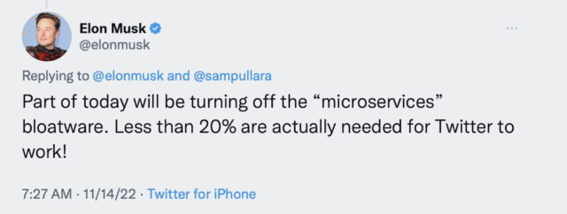
There are lots of takes and summaries of what’s been going on at Twitter. Here’s a pretty good one which runs through, well, this morning(ish). At which point Space Putin tweeted:

Elon Musk tweeted: Part of today will be turning off the “microservices” bloatware. Less than 20% are actually needed for Twitter to work!

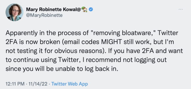
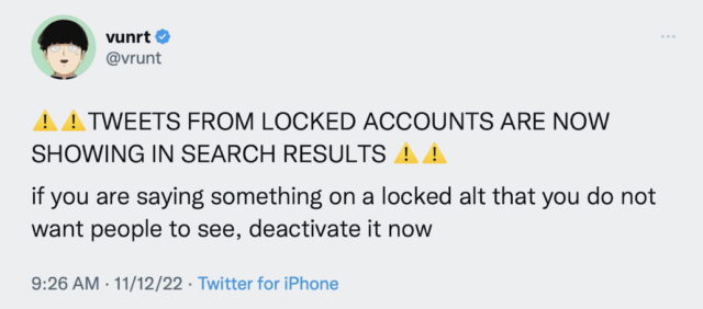
Shortly thereafter people observed that two-factor authentication, while still active, was no longer sending confirmation codes when people tried to log in. And even more ominously, that tweets from locked accounts (that only their mutual followers should be able to see) were appearing in public searches:

Mary Robinette Kowal tweets: Apparently in the process of "removing bloatware," Twitter 2FA is now broken (email codes MIGHT still work, but I'm not testing it for obvious reasons). If you have 2FA and want to continue using Twitter, I recommend not logging out since you will be unable to log back in.
vrunt tweets:TWEETS FROM LOCKED ACCOUNTS ARE NOW SHOWING IN SEARCH RESULTS

if you are saying something on a locked alt that you do not want people to see, deactivate it now

A few days ago I thought it was pretty likely that Twitter would either file for bankruptcy or suffer a catastrophic failure by the end of the calendar year. Given how fast things are moving (and breaking), I think it’s entirely possible that one or both will happen by Thanksgiving.

It’s been a shitshow of epic proportions.

I remember first seeing Twitter back around 2007 (I think at my friend Emma’s annual Boxing Day party) and thinking it was kind of a waste of time. I joined it (my profile says) in June 2008. I didn’t use it a lot the first couple of years, but it grew on me. I’ve made over 37,000 tweets, which works out to about 7 per day. I used to forward all my tweets to Facebook, until Fb dropped support for that integration. Twitter has not been an integral part of my life. I haven’t really met any good friends there, although I’ve made a few, and connected with some people through it who I wouldn’t have otherwise. I use it to discover things like audio dramas, and comic strip artists, and to follow some creators I wouldn’t be able to otherwise, like J. Michael Straczynski.

It’s probably inevitable that almost every social media platform is going to either die or fundamentally transform in some way. Maybe some of the smaller ones, like Dreamwidth, can establish a steady state where they continue on unless something catastrophic and unforeseeable strikes them. But the big commercial ones are motivated – often forced – to keep growing, and they’re always going to hit a wall and have to figure out what’s next once the growth ends. Facebook is struggling with that existential crisis right now. We may be seeing the end of free, ad-supported social media as we know it, and something new will take its place, as it supplanted blogs as the dominant social media, and as blogs supplanted bulletin boards and mailing lists.

Anyway, I continue to write here from time to time. Maybe I’ll write a little more often. (Boy, if I had a dime for every time I said that, I might be able to buy Twitter from Space Putin.)

Meanwhile, other than here you can also catch me on Mastodon, the upcoming not-so-new hotness which many Twitterers are flocking to. I’m @mrawdon@sfba.social, spouting similar crap to what I spew(ed) on Twitter. Maybe I’ll see you there?

Online Personas

Recently I had a little conundrum about what persona I wanted to present in some online communities I’m in.

When I first got online – around 1989 – this wasn’t really a concern. I mean, it was for some people, I’m sure, but for most people the need and the tools weren’t really there. I didn’t participate in any dial-up BBSes, and on USENET and on mailing lists it was usually the case that your e-mail address and real name were right there in anything you posted. By today’s standards those communities were very small, and safety and privacy was not much of a concern for most people. There were a few communities which developed anonymizing posting systems, but they were in my experience very much the exception.

I had a brief fling with changing my display name on USENET in college to “Night Watchman”, because I was often online late at night posting stuff. It seemed cute at the time, but kind of dumb now.

(I have one friend who to this day refers to me as ‘rawdon@rex’, since ‘rex’ was the name of the machine I posted from in college. Machines in Tulane‘s computer science department were named after Mardi Gras parades.)

I’ve never been shy about posting under my own name, on USENET, on mailing lists, on social media, and on the web, including my journal. The one thing I’ve generally avoided doing is posting my address and phone number. Not that these things are particularly private – I have a listed phone number1 – but I figure that a lot of shenanigans and mayhem are largely because of opportunity and convenience, and I can save myself most of those potential headaches by not making it trivial for people to find me. (Of course I have no idea whether these precautions have had any effect at all.)

People who want to remain anonymous or appear under an alias is much more common today – and often for good reason – but it’s still not really a concern of mine. What triggered the recent conundrum is the growth of services where you only appear under a “handle”, which by convention tends to be short and memorable. The two sites I was interested in were Magic: The Gathering Arena and Twitch, which only show users under their chosen handle. I think this grew out of online video games of the 1990s and 2000s, and a lot of people who were active in those communities have consistent and often (?) memorable handles. I wasn’t active, and so I don’t – and I kind of envy them.

I could have simply used my name ‘MichaelRawdon’, as my handle – and on Twitch I did for a while. The advantage on Twitch is that when I interact with a streamer they could call me by my name. The disadvantage is that almost no one else uses their name as their handle, and so it felt out of place and a little lame. I also wanted both of those to have the same handle, so in the event I interacted with the same people on those platforms they would possibly recognize me.

My first attempt at a distinctive handle was ‘mRawd’, but that didn’t feel right. After several months I hit on the following: My account on Twitter is mrawdon, and I realized I could capitalize it like “MrAwdon”, in theory pronounced like “Mister Awdon”. That felt a little clever and a little more sensical, so that’s what I went with.

It’s worked out… okay. A couple of Twitch streamers end up calling me “Mister”, which is a little odd but at least a name they’re not stumbling over. So I think I’ll stick with it for a while.

(Why didn’t I go with ‘rawdon’? Mainly because it’s already taken on Twitch and on Twitter, and maybe even on Arena. It’s an uncommon name, but common enough that it’s already taken in many online sites.)

I wish Twitch did what Discord does, which is allow you to choose a default handle, but then to customize your display name for each channel. I’d definitely make use of that by having a recognizable handle for Twitch channels who know me from other area (e.g., who I interact with on Twitter, or support on Patreon), but having something else for most streams where they have no reason to know me.

Anyway, maybe too many words about too small a subject. I bet hardly anyone else ever worries about this sort of thing.

1 Kids, ask your parents what a ‘listed phone number’ is.

Trying the Official Twitter App

(This post is an adaptation of a Twitter thread I wrote on the subject last night.)

A few days ago I decided to try out the official Twitter app for macOS and iOS. Twitter has been slowly cutting back support for third party apps, so I was curious whether their app was any better than what I’m currently using.

For me, the answer is: a little yes, a lot of no.

For a while Twitter had dropped their macOS app entirely, but the Mac Catalyst technology prompted them to port their iOS app to the Mac. I probably wouldn’t have tried this experiment otherwise.

My current Twitter client on both platforms is Tweetbot, which is great, and would probably be even more great if Twitter weren’t slowly crippling it by cutting back on what third party clients can do with their APIs.

Here’s what I thought of the official clients, across both platforms:

The Good

  • Being able to see the count of responses and likes to a tweet (the “ratio“) is nice. Tweetbot shows like count but not retweet count, presumably because Twitter’s API doesn’t provide it.
  • Being able to see polls inline is very nice. I often see tweets where someone asks a question and I just respond, and sometime later realize it’s a poll.

    I believe Tweetbot can’t show polls due to Twitter’s API deficiency. I always have to open a poll in a browser to vote.
  • Pinned lists are very nice, probably the one feature I don’t think Tweetbot really has which I wasn’t expecting and immediately found useful.
  • The bookmarks system looks nice, but I haven’t really used it. I had no idea it exists. Presumably because Twitter’s API doesn’t vend it for third-party clients.

The Odd

  • The iOS client has a sidebar which is just the search field and “what’s happening”. Not very useful. I miss the responses sidebar from Tweetbot.(Which used to also show most notifications until Twitter’s API dropped support for that.)

    So I mostly hid the search bar in my trial. Which was weird because then the timeline doesn’t get any wider, it’s the same width with a whole bunch of whitespace on either side, and no way to adjust it. Seems like poor design.
  • Tweetbot has a nifty muting system where you can choose where people are muted (everywhere, only in lists, etc.). I use this a lot to manage my lists, following people and then muting them in my timeline but not elsewhere. I was concerned the Twitter wouldn’t give me that control, but muting only mutes from the main timeline, so it’s fine, but took some trial and error to figure out. I’m not sure whether more fine-grained control here is something I’d need.
  • It’s annoying that I can’t (AFAICT) mute individual accounts for limited periods of time like in Tweetbot – that functionality only seems to be available for keywords. I use this a fair bit (e.g., if someone is going on about some subject I don’t care about in volume I’ll mute them for a day), so I would probably miss it at some points.
  • Tweetbot seems to have its own separate mute list data, so I had to go through and re-mute dozens of people. I don’t know whether this is because of Tweetbot’s richer muting system, or a deficiency in Twitter’s API. But it was annoying.

The Bad

  • The client doesn’t show me the number of unread tweets for my main timeline or whatever list I’m viewing. I missed this a lot.
  • The client doesn’t keep my reading spot in lists. So at some point when I open a list it will scroll me to the top, no matter how many tweets in the list I haven’t read yet. This is extremely annoying and on its own almost enough to send me back to Tweetbot.
  • It seems my reading spot in lists and the main timeline are not synced among my various devices. This is also extremely annoying, as scrolling down to find where I’d last been reading is not really feasible.
  • Sometimes when I come back to Twitter after a while away (such as overnight), the client shows a “Show more tweets” prompt above my last spot in my timeline, but clicking it almost always shows me the newest tweet in the gap, not the oldest, so I have to scroll back down to get to where I was.
  • The threading in the client is nice in some scenarios, but pretty annoying when scrolling upwards, to see the most recent tweets in a thread first (i.e., at the bottom). This seems like a poorly-thought-out user experience. It would make sense if one scrolled down to get to the latest items in one’s timeline (which, TBH, is kind of what I want anyway, but they’re never going to do that).
  • The notification system is pretty annoying, as it supplies a lot of customizability but most of it I don’t want. I pretty quickly figured it would just be easier to deny it notification privileges at the system level. This needs some user-quality-of-life evaluation to simplify these settings, probably cutting about 75% of them.
  • Holy cow there are a lot of ads, excuse me, “sponsored tweets”, felt like I saw 2x-5x more ads on Twitter than on Facebook. Tweetbot shows me none of this nonsense (which is presumably why Twitter doesn’t want you using third-party clients).

    Ads might be more bearable if I could assign them a different background color or something.
  • There’s no way in the app that I can find to set a show/hide keyboard shortcut on macOS, which I use all the time in Tweetbot. Maybe I could do it through a macOS system pref, though I did a short search and couldn’t figure it out. It would be a much more useful app pref than all the notification stuff.

I could probably live with a lot of the Twitter app deficiencies if it remembered my reading spot in all lists and synced across devices. But overall it needs a lot of polish, so I’m likely heading back to Tweetbot.

I’m not sorry I tried it out, but I am kind of surprised that the app – on both macOS and iOS – feels like it has a lot of maturing to do.

New Internet

Tuesday we upgraded our Internet service for the first time in, well, a long-long time. How long? Before the upgrade we were getting 6 mbps download speed. Good enough for a lot of things, but downloading sizable things like, I don’t know, apps, took a long time. Good things there aren’t a lot of apps in the world!

Our ISP is Sonic, which is one of the few ISPs which has stuck up for net neutrality over the last few years. I signed up with them for DSL when I bought my townhouse in 2001, and later upgraded to their service called “Fusion” (which I think is basically ADSL), which was pretty good at the time, but not really up to the level of Comcast at the time. But I was happy with them because their customer service is great. And they don’t have any bandwidth caps. And frankly at the time there wasn’t really a better non-cable service available.

But now there’s fiber. Sonic has been rolling out their own fiber service, but it’s not available down here. Instead they resell AT&T fiber. So I signed up for their gigabit (1000 mbps) service. Which is 167 times faster than what we had, because that’s how math works! AT&T sent a tech out to install it Tuesday morning, and he showed up 5 minutes after the beginning of our service window. He was also great: We walked through the house showing him how things were laid out, and he was able to connect to our house’s in-wall ethernet easily enough, and from there it would connect to my AirPort base stations to use our existing wireless network. The service info said it could take up to 4 hours to install, which I had a hard time believing until he told me they had to run a cable from the telephone pole to our house. All told, it took about 2-1/2 hours to get everything set up and tested. The testing had a couple of glitches – a few devices needs to be rebooted to work correctly, not sure why, but things seemed fine and he left shortly before noon.

Well, there were a couple of follow-on issues:

First, I got a box for Voice Over IP phone service for our land line. (You can tell we’re Gen X because we still find having a land line useful. Although if it weren’t bundled with the service I’m not sure it’s that useful.) It turned out that it had a new phone number – annoying! I e-mailed Sonic, and it turned out that it was a temporary number and they moved our old number Wednesday night. So that was easy!

The other issue is that we’re only getting 100 mbps on our network, not a gigabit. And this is a bit harder to solve, because it turns out that the AirPort Express base stations we have only support 100 mbps on their ethernet ports. I’m not sure what’s up with the AirPort Extreme upstairs which shows the same behavior, but I suspect one of the three switches we have on the network might also only support 100 mbps. Still! It’s 17 times faster than what we had! (Because that’s how math works!) It’s already pretty great!

But, it seems I’ll want to upgrade our network sometime in the not-to-distant future, once annoyance at not getting full speed overcomes my inertia of having a network that already works. A couple of friends recommended UniFi, while another strongly recommended an Asus router. I know several people like Eero, but I’m a bit reluctant to go with an Amazon-owned product (or Google or Facebook, for that matter, all for the same privacy-related reasons). It sounds like UniFi has a lot of knobs which I probably don’t need (or maybe just don’t yet know that I need!), so we’ll see. I should probably audit the ethernet switches first. One thing at a time.

Anyway, it’s so much faster than what we had. Suddenly updating apps on our phones is blocked more on the installation step than the downloading step. Downloading podcasts is super-fast. Hopefully we won’t have any more “why is the network so slow?” issues. And while we’ve never had a serious problem streaming TV at the slower speed, this ought to relieve any concerns we might have, especially since we’re not 4K TV viewers yet.

Look at us, joining the 2010s just in time for 2020! Because that’s how time works!

Social Media

I have some thoughts on the turmoil in corporate social media recently – meaning, in particular, Facebook and Twitter. For posterity, the precipitating events are:

I’m hardly the first – or the five hundredth – person to observe that this is the natural development of handing over our online social connectivity to a few corporations who are mainly driven by profit motives and which mainly make money through advertising. The details of election manipulation were perhaps harder to foresee, but it seems clear that there was plenty of room for badness.

So what now? While there’s a movement to delete Facebook (#DeleteFacebook), it is still a tremendously useful resource for keeping in touch with friends and family. (My observation is that it’s especially handy for generations older than mine.) Twitter is less useful for that purpose, but it’s more useful for keeping up with people involved in or who share my hobbies and interests.

Frankly I trust neither of these companies, as both have long histories of not caring about their users. Facebook in particular I think is deeply untrustworthy as Mark Zuckerberg’s 14-year apology tour indicates. Twitter I think is at least as incompetent as they are untrustworthy, and I’m not sure if that’s better or worse – probably it just means they’re going to sell to some large, more solvent company in the next few years. (My guess is Google will buy them.)

Should I stop using them? Yeah, probably. Will I? Probably not. But I have been making some changes in how I use them:

  • I recognize that making political posts is not going to change the opinions of my followers on these platforms. So I’ve been cutting back on doing so unless I think I have something novel to say.
  • More seriously, I’ve been trying to avoid sharing political posts unless the post’s originator is someone I know and trust. The means of political manipulation has been to promulgate divisive political propaganda – at both extremes of the political spectrum – and while I’m solidly left-liberal, I see little reason to help them.
  • I’ve also been cutting back on following people whose main social media activity is to share political content which they didn’t write. So if that’s mainly been what you’ve been posting, then there’s a fair chance that I’ve stopped following you. I follow people mainly for what they have to say, not for them sharing content from others.
  • I also use an ad blocker (AdBlock on the Mac, 1Blocker on iOS), and also a tracker blocker (Ghostery). Since ads can be a vector for malware, using an ad blocker is also a security measure. Moreover, if I visit a site which doesn’t let me read its articles because I’m using an ad blocker, then I stop visiting that site.
  • My Twitter client on both Mac and iOS is Tweetbot. If Twitter drops support for third-party clients and doesn’t come up with a good client of its own with the features that I want, then I’ll probably stop using Twitter. I’d probably do the same thing with Facebook if they ever remove the live feed.

In the long run we’re going to have to move away from corporate-owned social media networks, or at least move to ones which we pay for, where we, not the advertisers, are the customers. Maybe something like Micro.blog or Mastodon is the future. It seems like something like that should be viable, but whether it will become popular is something else altogether.

The bottom line, though, is that it’s got to be something each of us owns. Because if you don’t own it yourself, then you don’t own your own presence on the Internet.

Which, despite my relative inactivity here lately, is why I still have this blog.

(Oh: This is the second post I’ve written titled “Social Media”. Things have changed a bit in the 9 years since I wrote the first one.)

Obduction

This past weekend I finished playing Obduction, the latest game from Cyan, the folks who made the MYST series of games. I backed it on Kickstarter and played it on the Mac through Steam, starting with some of the, well, I guess post-beta but pre-final releases.

Not to bury the lede: It’s a fine game which I enjoyed thoroughly! But I wanted to write a little historical perspective about my experience with Cyan’s games.

A friend of mine introduced me to the original MYST back in the mid-90s, and I powered my way through half of it, got stuck, put it away for a few months, then came back and finished it. While I enjoyed the puzzles, to me it was primarily an experiential game, the first game I ever played where I had genuine moments of feeling like I was really there – in hindsight an amazing accomplishment since the rough edges due to the technology of the day (texture mapping, animations, etc.) were quite apparent.

I played the sequel, Riven, when it came out, and while the technology was considerably improved (the renderings were gorgeous), the story felt less expansive and a little more awkward than the first game. (I wrote a little about it at the time.) A few years later I picked up the third game, MYST III Exile (which was not made by Cyan), and felt that it shored up the deficiencies of the previous games, and despite the thrill of the new of the original game, I think Exile is the best of the MYST series. (A bit more here.) I was also a big enough of the fan of the series that I read the three novels they published (which were okay).

I thought things went off the rails a bit with MYST IV: Revelation (also not by Cyan), which, despite having a good story, had some puzzles that were very unintuitive and frustrating to try to get through without a help from a story guide. And then I only barely cracked MYST V: End of Ages (which was by Cyan), in part due to some serious problems it exhibited with a lot of Mac technology at the time (some graphics cards would cause it to freeze the whole machine regularly), and also due to a disenchantment with the rendered animated people, which felt like a big step down from the interleaved live action footage from other games. (Sadly, I bet it doesn’t run on newer Mac hardware, and it looks like the Steam version is Windows-only, so I may never return to it.)

Despite that finish, ten years later I was pretty stoked for Obduction!

It took me a little while to get into it, partly because the early releases seemed to have some bad performance problems on Mac hardware, requiring me to ramp down the resolution quite a bit to get decent performance, so I played a few hours of the game late last year and then put it away for a while. I picked it up again a few weeks ago and played a couple of hours per week before finishing it. The final version has much better performance and I was able to get pretty nice resolution out of it with only a couple of moments of stuttering (some of which I suspect involved loading resources from disk). For reference, I played it on a late 2013 model MacBook Pro, so it might play better on a newer Mac. (I did find that the “seed swap” devices were often tediously slow, though.)

Obduction has a premise similar to MYST but arguably a little more grounded: Rather than mysteriously arriving on an island, you-the-player are one of many people who have been plucked from your time period and dropped into a bubble of Earth in the middle of another world. The game’s title plays on the sounds-like word “abduction” as well as the dictionary definition of obduction (“an act or instance of drawing or laying something (as a covering) over”) and the tectonic definition (in which layers are flowing above or below each other), all of which are appropriate in the story. You find yourself in a nearly-abandoned town called Hunrath, with chunks of Earth from different time periods lying around, messages from the former inhabitants, and signs of a battle from the recent past.

As in the MYST games, you need to find clues to what happened and solve puzzles to get things working in the village again, until you eventually unlock the secret as to what’s been going on and how to get beyond Hunrath to start fixing things. There are a lot of clever bits, including ones that make you feel clever when you figure them out.

The game’s biggest problem is that some of the puzzles are still too hard, in the sense of being basically unintuitive: You need to stumble on the right thing, or put together pieces which don’t logically go together. I relied on the player’s guide which came with the Kickstarter reward for some pieces, because I just wasn’t interested in endlessly wandering around some parts of the world to look for something I’d missed. I also found the puzzles involving the alien number system a little too annoying. But, your mileage may vary. Unfortunately, the final puzzle of the game I found utterly unintuitive and ended up going onto the web to find out what I had to do to solve it the “right” way (as it leads to multiple endings). They do need to walk a fine line between making the puzzles challenging and making them understandable, and I think Obduction is just a tad over the line to not understandable, though better than MYST IV. The first three MYST games all nailed the balance, I think, but maybe they just made it look easier than it is.

Experientially, though, Obduction is a pretty amazing piece of work: Wonderfully envisioned and executed, with only a couple of spots that feel a little glossed over (in some cases by necessity, since you still can’t really interact with the few characters you meet in the game). The sense of history and tragedy conveyed in Hunrath is extremely well done, particularly the bits in Farley’s house.

So, while slightly flawed, I found it perfectly enjoyable and rewarding, and while I might not run through it a second time for a few years, many bits have stuck in my memory, as with any good story.

I hope that Obduction isn’t Cyan’s swan song with this genre of game (which has fallen out of favor since its heyday around the turn of the millennium), but if it is, then they’ve gone out on a high note.

(image from the Obduction web site)

15-Year Appleversary

Today marks 15 years since I started working at Apple.

Coincidentally, as part of the 30 Years of Mac celebration a month and a half ago, Apple put up posters with the name of every employee. I believe there are 12 posters, and I’m in the very top row of poster 3. (That’s actually too high off the ground for me to get a good picture with my iPhone; what I need is a camera with a good optical zoom.) I guess that means I’ve been at Apple longer than over 85% of all employees. That’s a long time, especially in Silicon Valley.

I remember back when I was going to interview, I told two of my friends at my old company. One of them immediately said, “Oh, you are so out of here.” It didn’t seem to clear to me at the time, but she was right!

15 years ago it was me and my two cats moving into temporary housing. The Dot Com boom was in full swing. Mac OS X was under development but wouldn’t be released for another two years.

10 years ago Debbi and I had been dating for almost three years, and she had a couple of kittens. The Red Sox were about to embark on their first championship season in 86 years. Macs still ran on PowerPC chips and Apple stock was riding up on the strength of the iPod.

5 years ago Debbi and I were still living in the townhouse. My cat Jefferson would pass away a year later. The iPhone was already a big thing and I think its App Store was available by then, but the iPad was still in the future.

1999 feels like a different era, yet it wasn’t so long ago. It feels like so much has happened, yet it all felt like a series of manageable transitions while it was happening. (c.f. John Gruber’s “This is How Apple Rolls” piece – for the most part, that’s how a person’s life rolls, too.)

Where will I be in another 15 years?